
Case study: Volleyball World
Volleyball World is the websiite of the Fédération Internationale de Volleyball (FIVB), the international governing body for all forms of the sport.
They’re a long-standing client of Deltatre’s. They use our Forge content management system and we provide them with design and digital strategy services.
They were launching a premium video streaming channel and wanted us to design new CMS components, and to propose a strategy to promote it accross their website and app.
I was brought in as design lead to help the account’s regular designer to gather and analyse evidence, propose solutions and present our findings.
But as we worked on that, it became clear that there were deeper issues that needed fixing. We set about solving these problems and delivered:
40% YoY increase in visitor numbers, 88% more returning users and a 90% increase in dwell time.
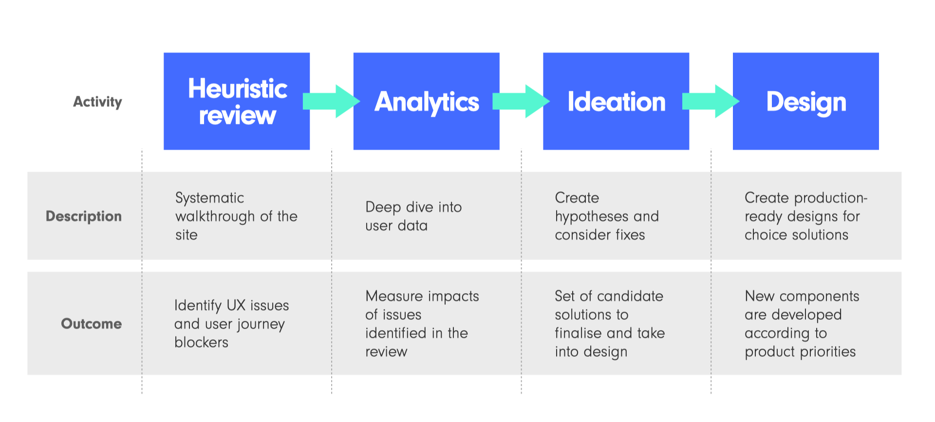
Starting point
VBW asked Deltatre to use one of our regular strategy review meetings to present some ideas to promote the new video service.
I audited the site, looking for ways to surface video.
This became the framework of the project. We walked through the structure, analysing every page template.
The designer and I developed a number of proposals and worked them into a Keynote deck to take to the session.
The example below was deliberately over-the-top to show what ‘too much’ looks like.
I like to use a ‘show don’t tell’ approach for decks like this.
Hence we included lots of examples from reference sites to focus discussion.
However the audit had exposed deeper issues which were impacting on the whole user experience, not just the ability to promote the new video offer.
Deeper issues
A lot of the issues we saw came from an effect that I call design entropy
Entropy
Entropy is a concept used in diverse contexts, but the TL;DR is that everything tends to chaos and work is required to create and retain order.
For example, it takes effort to organise sand into a sandcastle.
Left unattended, the sandcastle will decay into a heap of randomly arranged grains, and then disappear completely as its organised state vanishes into the chaos of the beach.
Design Entropy
That same thing can happen to mature websites.
Small changes are made over time. Being small, there isn’t a proper analysis of the impact of each one, but they all add up.
The result is a ‘death by a thousand cuts’ effect.
Not one big thing wrong, but lots of tiny issues which compound to create a large impact on a page, and the whole site gradually loses its original structure.
Typical signs of design entropy
Primary navigation is overloaded with more nodes than it was designed to carry
Poor secondary and tertiary navigation - it’s hard to find things and easy to get lost
Mid-journey pages which lack a clear narrative or purpose
Multiple components doing similar, but not quite identical, things
Inconsistent placement and styling of calls to action
Modules used in ways they weren’t designed to be used
Fixing the issues
Without a budget for user or A/B testing, I proposed a partnership model combining our UX expertise and VBW’s domain knowledge with evidence from analytics.
This used a four-step process.
The review stage was mostly done, so we moved quickly to the analytics.
Analytics
We used data from Google Analyics 4 (GA4) and Microsoft Clarity.
GA4 provided macro-metrics like user types, entry/exit points, and interaction volumes.
Clarity complemented this with page-level data such as heatmaps and session recordings.
Here’s couple of slides from our analytics report showing how we combined the two.
The lower graph on the GA4 slide shows large spikes in visitor numbers during the Volleyball Nations League (a flagship tournament for VBW) and the Paris Olympics.
The upper trace is events - clicks, scrolls etc - per user. This remains flat. Users are attracted by high profile tournaments, but they’re not engaging with the content.
The Clarity heatmaps show users click/tapping on non-functional elements in a mid-page module. They’re expecting onward journeys where there aren’t any.
This validated one of our hypotheses: poor recirculation was caused by design and navigation issues. It gave us an evidence base to evolve solutions.
(Values are obscured for client confidentiality reasons)
Design
We reimagined designs to restore site order: more intentional pages, a cohesive visual language and more streamlined navigation.
Old page top
New page top
Page top and nav
1 - IA reworked so that the overloaded navigation could be streamlined
2 - Non-navigation elements grouped into a clear functional nav
3 - Clean, visually led tournament navigation replaces the confusing card-based version
4- -Story promos given a strong, clear look
Old Live & Upcoming carousel pattern
New Live & Upcoming pattern
Content carousels
5 - Rail split into tournaments to allow skim browsing, especially on mobile
6 - Content cards resized and rearranged to showcase more content
7 - Text moved below the cards to aid readability
8 - Onward journey given a stronger visual look and moved into the user’s eyeline
Outcomes
We saw significant growth in all of our key KPIs.
The client was so pleased that they posted about it unprompted on LinkedIn.
The improved stats are detailed in the post.
