Case study: International Cricket Council
The ICC is the global governing body for cricket. Its remit covers all levels of the game from amateur to elite, with an emphasis on encouraging grass-roots participation.
Deltatre won the work to become ICC’s design partner in 2023. We developed a brand new website based on our proprietary, sport-optimised content management system.
The redesign was carried out to very aggressive deadlines and some design debt was run up as a result. This impacted on video views for the T20 World Cup, an ICC flagship event.
They challenged us to bring these figures back up to expected levels. As well as improving consumption of free-to-view video, they also asked us to propose ways to drive more traffic to the premium subscription video service, ICCTV.
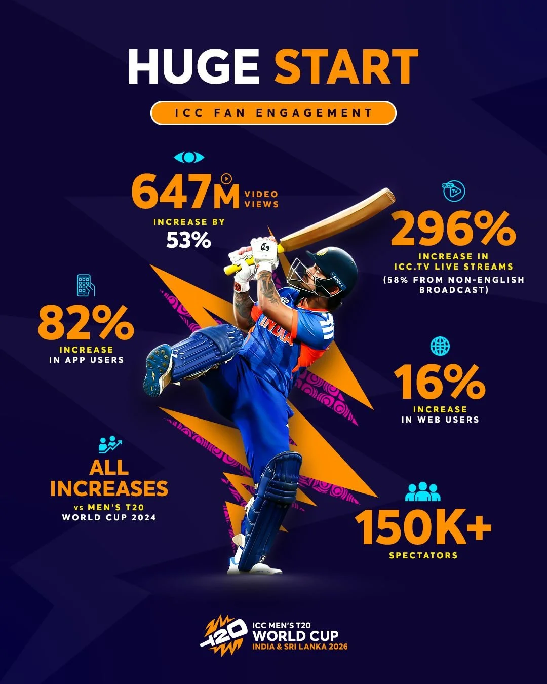
My team delivered increases of 58% for free video views and 300% for ICCTV streams.
This was based on a 16% uptick in general traffic, so the impact came from our design changes.
Tactical fixes
Although we wanted to take a strategic, evidence-based approach, there were a few obvious problems that we could tackle straight away.
In particular, there were layout issues arising from the rapid delivery of the original site. It’s a common issue, especially under time pressure, that designs are created and reviewed on large screens, but aren’t checked on realistically sized viewports.
This seemed to have happened with the initial ICC designs.
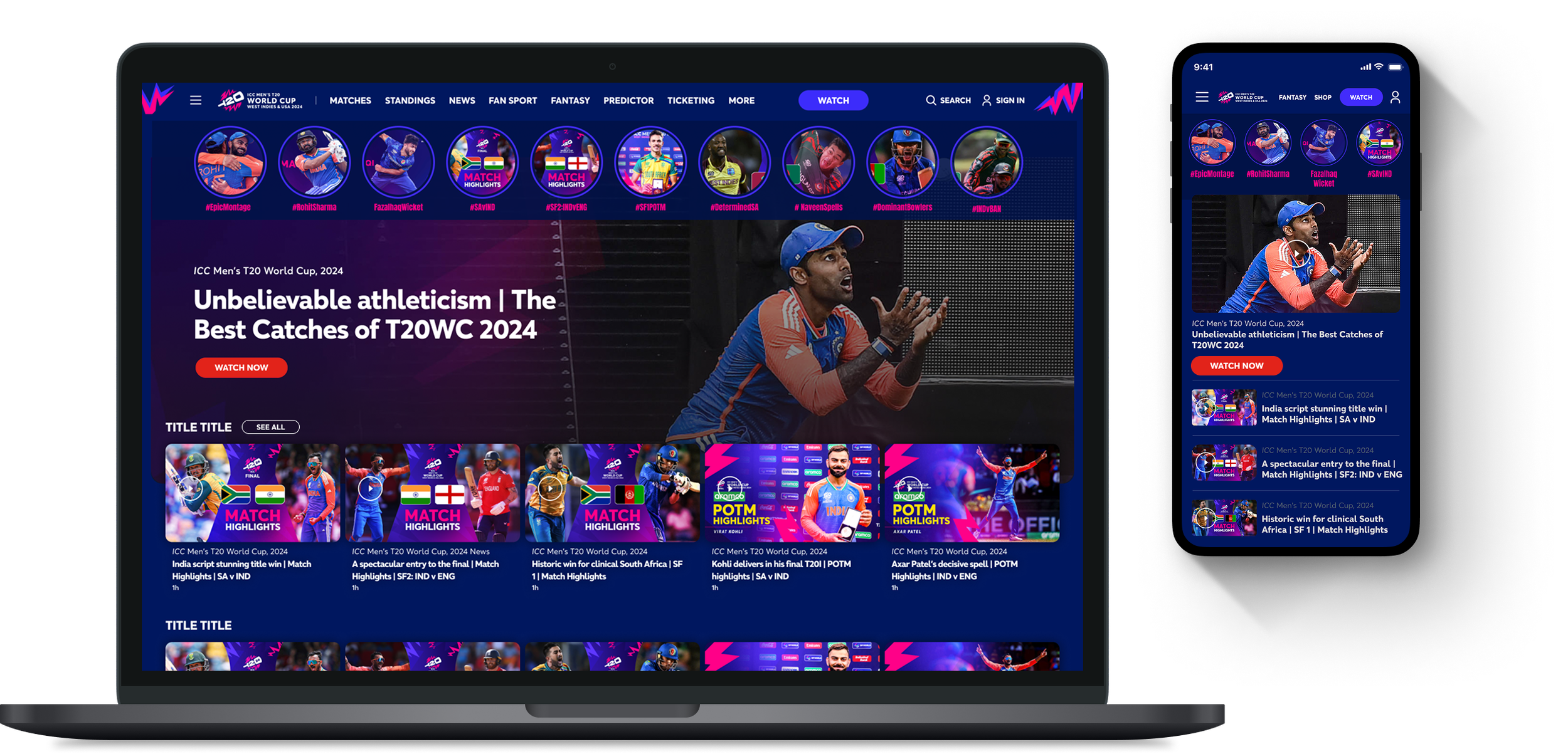
Previous design
In the design that was live at the time of the 2024 T20 (above), it’s clear that the content isn’t fitting well into the viewport.
The hero is very large and the video promos below are only just peeping into the frame. The tiles are tall, so their headlines are not visible when the page loads.
I also noticed that the ICC’s content managers tended to use images with burned-in text, which clashed with the overlaid headlines from the CMS.
New design
I changed the aspect ratio of the hero to pull the content into the viewport and added a large opaque area to contain the text.
That gave us room to add an extra social media-style ‘moments’ rail above it - this content had proved very popular during the 2024 T20 so we wanted to boost it for 2025.
I used 16x9 thumbnails in the video rail below the hero. This reduced the height, and allowed us to place the headlines below the images. That stopped them clashing with any burned-in text, but still keeps them in the viewport.
As a team we proposed five quick-fix changes, which we were confident would address some of the design issues that had crept in during build
Strategic review
While those changes were going through, I drew up a plan for a more strategic approach. Although it was known that some design debt had been run up, it was unclear exactly what the impacts were. So I started with a gap analysis exercise.
I normally score findings from this kind of review in two dimensions - the impact that the issue is having and the complexity of fixing it. High impact, low complexity issues are the obvious quick wins and we can prioritise the others with a backlog grooming session.
In this case the findings were less clear-cut. There were some fundamental structural issues which simple design changes wouldn’t fix.
In these slides from my report, you can see how these journeys could be improved. (Click/tap the images to enlarge)
Fixes
Much of the problem here isn’t the design, it’s the site structure and content management.
One reason clients choose Deltatre is our proprietary content management system - we call it Forge.
Forge uses tags to label content, for example with names of events, teams or players. These can then be used to aggregate content in promo rails and mid-journey pages.
They also allow content to be filtered and sorted to create a self-service browse-and-discover experience for fans
This means that the user experience is dependent on a robust tagging taxonomy which I felt was lacking, and this was one of the causes of the problems with content journeys.
I proposed a combined user journey and tagging taxonomy review. The plan is to map the key user journeys we want to support, and then create a tagging taxonomy to enable them.
Outcomes
The client initially agreed to the workshops, but then rolled back due to budget and resource constraints.
So I fell back to the process I’d successfully used with Volleyball World. I used a mix of expert review and user data to improve designs through analysis of user behaviour and good UX practice (see VBW case study here).
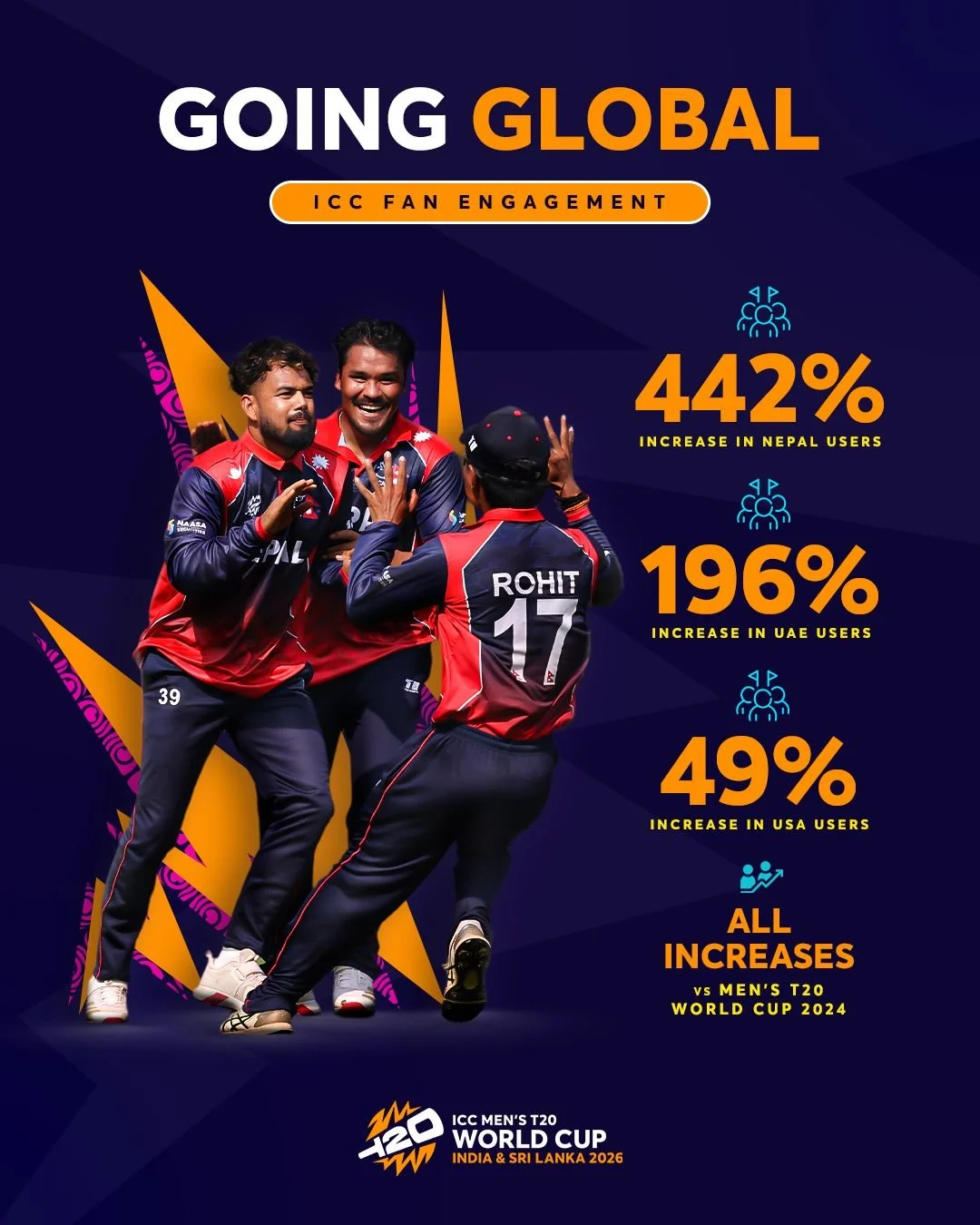
In February 2026 the client posted these images to their social channels and created this article celebrating, among other things, a 300% increase in traffic to ICCTV.